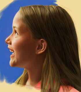
Two heads are better then one, or at least the old one.
After finishing the new "Canada Post Holiday Poster" the client asked if I could change the expression on the girl. Even after approval of countless sketches and pencils they still wanted it changed. I didn't think it was necessary but the client is always right.
I frantically called back my model(s). For the first poster, I used a model that had a twin sister. This time I tried incorporating both of them to get the expression the clients were looking for.
I do feel now the change was a good one. I just wished it wasn't 4 days before I left for Hong Kong.
This is the original Poster:
For client approval I drew up a tight pencil. This was tricky because I had to match the new head to the old body and get the proportions right.
After I brought this far enough along in color. I layered it onto the girl in the original poster. I had to do a lot of cleaning up and color matching. Notice, at this stage I enlarged her eyes and raised her eyebrows. (I’ll cover some of my Painter tricks in later Blogs)
The final piece:


